| Year | 2018 |
| Credits | Darren LeeData Visualisation Ben SimonsVisualisation Presentation |
| Links | |
| 3D Stereo | No |
| Tags | AMSA google-earth kml ocean |
This project is a visualisation of ship location data for June 2018 from the Australian Maritime Safety Authority
Background
The MV Blythe Star was a coastal freighter which sank off the coast of Tasmania in 1973. It lead to the most extensive air-sea search in Australian History, yet nothing was found. Some of the crew managed a self-rescue.
ABC Radio produced a podcast about The Sinking of the Blythe Star which contained an interactive map showing the ship's path. Unfortunately the ABC no longer serves the map. Instead, here's a rough outline.
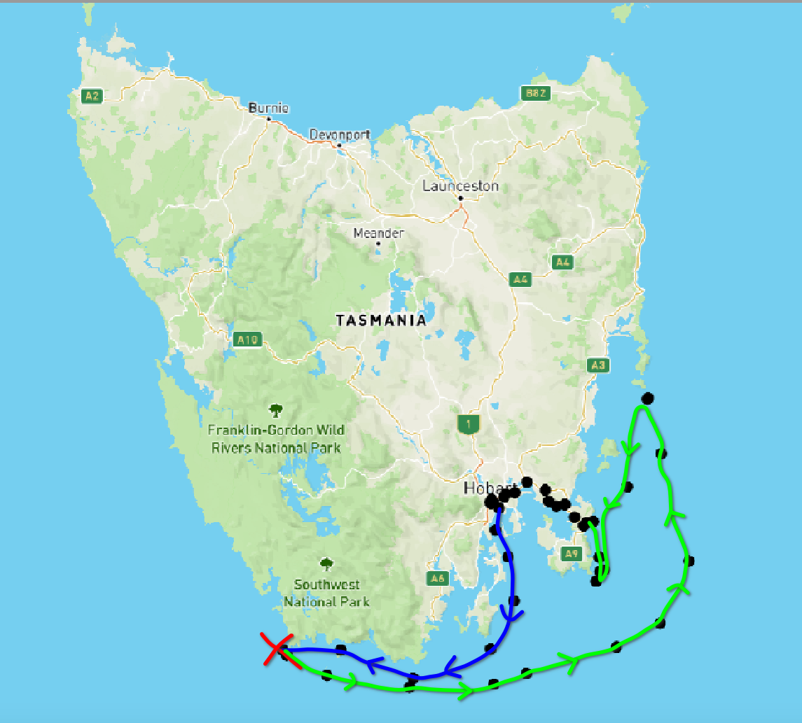

Hand drawn approximate map showing Ship's path, then lifeboat path
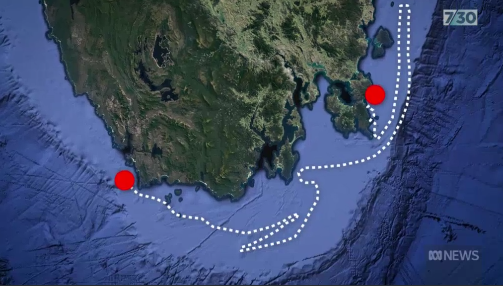

Screenshot from ABC 7:30 Report (below)
Above Left: The Blue line shows the track of the Blythe Star, from where it left port in Hobart. The Red Cross is an estimate of where the ship sank. The Green track estimates the lifeboat's path. Keep in mind no one knows for sure. There was no GPS back then. Once the lifeboat landed it didn't end there. The crew couldn't get off the beach! The cliffs were so steep. The Data Arena has a 360 panoramic video (not online) which shows the "3 Cape Walk" Tasmania Tourist Video. It shows these cliffs south from where the lifeboat landed. Nevertheless, the sheer vertical climb was accomplished. The rest of the dots indicate their overland trip back to Hobart.
These paths are estimates from the survivors and witnesses. They're not the sort of accurate paths we obtain today from GPS.
The search was called-off after 10-days -- with no sign of debris, ship, or crew. Most assumed all was lost.
Yet on the 11th day, news spread seven (7) of the crew had survived & self-rescued!
New Marine Safety Measures & Search Protocols
The Australian Government set up a judicial inquiry into what happened, and what could be done to improve marine safety & seach protocols.
This lead to the AUSREP (Australian Ship Reporting) system, operated today by AMSA (Australian Maritime Safety Authority). All large Australian ships report their position when in the Australian SAR (Search & Rescue Area).
The Australian SAR covers one ninth (1/9) of the Earth's surface.
It was the first "positive" reporting system.
More recent updates include LRIT - Long Range Identification and Tracking, and MASTREP - Modernised Australian Ship Tracking and Reporting System. Some of this data has been anonymised and sub-sampled over time and made available online.
This presentation was motivated by a visit to the Data Arena (DA) by 30 Lieutenant Colonels from the Royal Australian Navy.
Update 15 May 2023 - The Blythe Star wreckage found after sinking off Tasmanian coast in 1973
The disappearance of the MV Blythe Star off the south-west coast of Tasmania in 1973 prompted Australia’s largest maritime search at the time and eventually, a remarkable tale of survival.
Now 50 years after it went down, 7.30 can bring you the first pictures of the wreck, after the CSIRO pinpointed its location. Liz Gwynn reports.
https://www.abc.net.au/news/2023-05-15/blythe-star-wreckage-found-after-sinking-off/102349490
AMSA Data
By law, all Australian-Flag ships over a certain size must have a MASTREP beacon which sends its identity & position every 5-minutes to 5-hours, depending on the ship's location. Foreign-flag ships are invited to join the system. The data is DGPS. Using GPS Satellites, a ship's latitude & longitude can be located to within 10 metres!
This visualisation shows how much can be discovered - even when data is made anonymous.
The data shown here on Google Earth is a public version of the MASTREP data, made anonymous. We downloaded the data for all ships for June 2018. Actual vessel names are removed. There is just a Vessel ID. The locations have been simplified to "one location" per hour, if the vessel transmitted its location.
If you saw this data in a spreadsheet, you would see 3 columns:
| Vessel ID | Lat | Lon |
|---|---|---|
| 1 | 1.45879741667e+002 | -1.68102850000e+001 |
| 1 | 1.45879935000e+002 | -1.68111450000e+001 |
| 1 | 1.45880031667e+002 | -1.68111666667e+001 |
| : | : | : |
| 2 | 1.30849743333e+002 | -1.24704383333e+001 |
| 2 | 1.30849745000e+002 | -1.24704366667e+001 |
| 2 | 1.30849688333e+002 | -1.24704316667e+001 |
| : | : | : |
There are approximately 4217 ships in this dataset.
Vessel Path Representation
We collect all the points (lat/lon) for a given Vessel (say ship number 1) and join the dots to make a line. This is the ship's path. The line is coloured by its total number of points. A rainbow-coloured scale is shown, blue to green to red. If the line has around 100 points then it is coloured blue. Around 350 points it is green. If there's 700 points the line is red.
Note the data indicates one point per hour. Some lines have up to 700 points. 700 points divided by 24 hours returns 30 days (700 / 24 = 30). The 30- days of June. Red lines show ships which have been reporting every hour of June.
There are also some strange tracks (such as those red lines which link capital city locations). We're not sure what they are. We left them in there.
The lines are converted into KML Format and displayed in the Data Arena's version of Google Earth, based on Google's Liquid Galaxy, which uses the seven machines in the DA Linux Cluster to create a 360-degree panorama on the DA's cylindrical display. The DA's Wireless Space Navigator is used to explore the data.
Inferences
Even though there's only 3 columns of data: vessel-ID, Lat, Lon, much can be inferred from the position of the Vessel Path on the map of Australia, and from the path shape. Circles indicate places where ships have anchored. The ship while at anchor will be pushed around by the winds and tides. Sit at anchor long enough and the path becomes a circle, drawn around the centre anchor point.
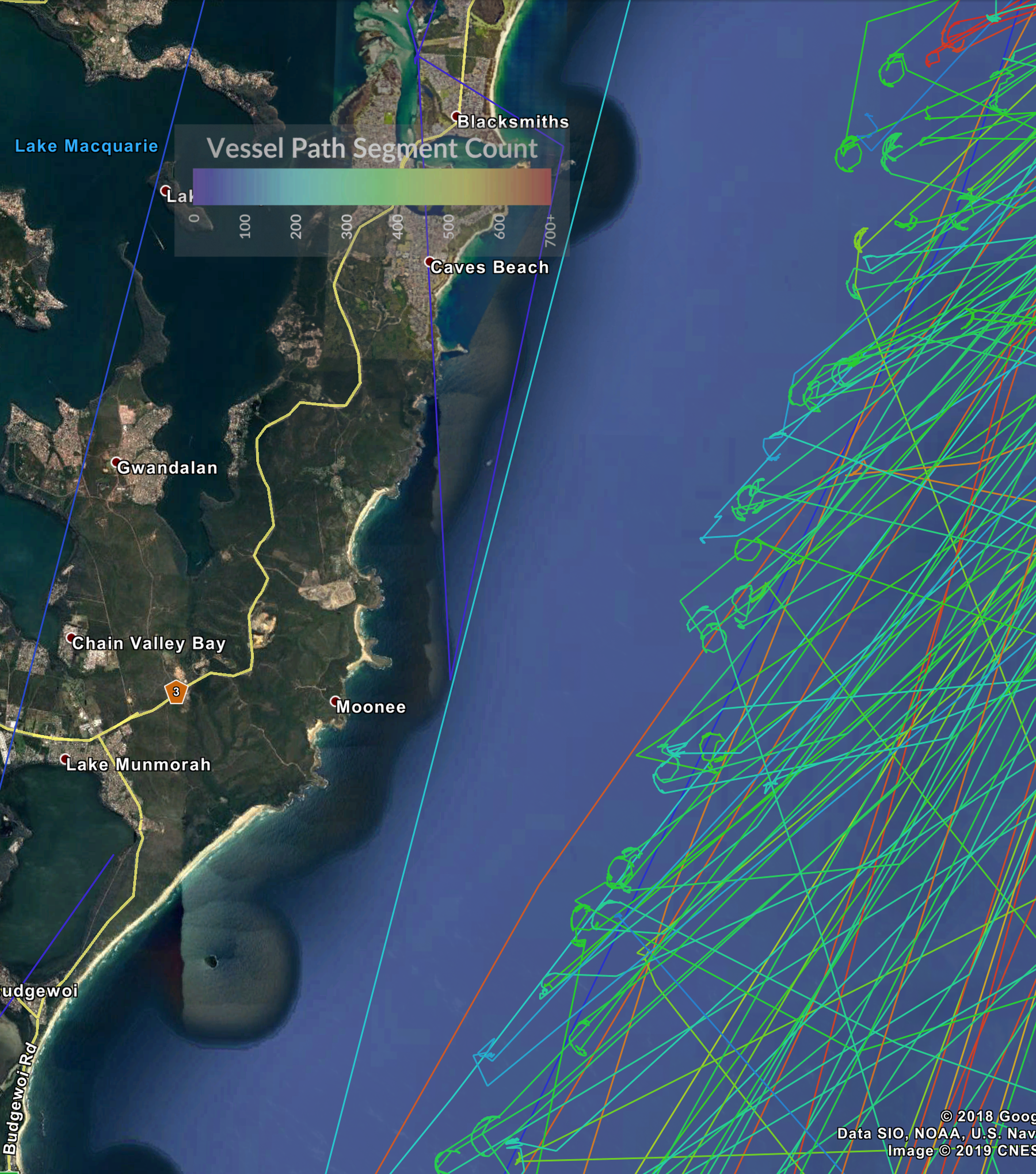

Perhaps more fascinating are those ships which did not sit at anchor long. They drew partial circles. Paths which have matching partial circles might have been anchored at the same time - they experienced the same winds and tides. Yet time was not in the data-set. Only Vessel-ID, lat, and lon.
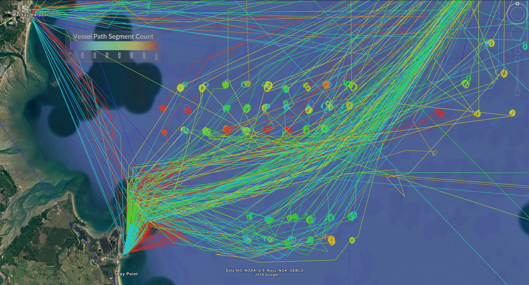

Elsewhere on the map, such as Mackay in Queensland, large "parking lots" can be found. Indeed, ships which have sat moored in the same place for a month are coloured red. The odd colour patterns suggest an irregular allocation of mooring spaces for boats waiting to dock at Hay Point, just south of Mackay Harbour.
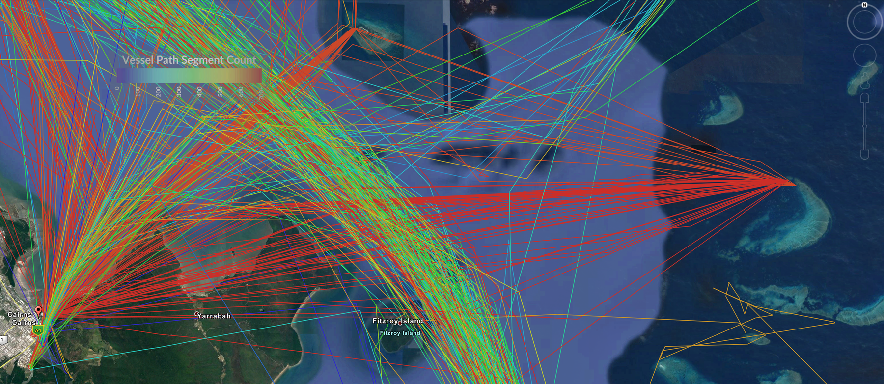

Further north, we see 2 wide spikes, one orange, one red, which pinpoint 2 spots on the Great Barrier Reef. If we zoom down to this location we see the incredible accuracy of both this AMSA data, and the high resolution imagery available.
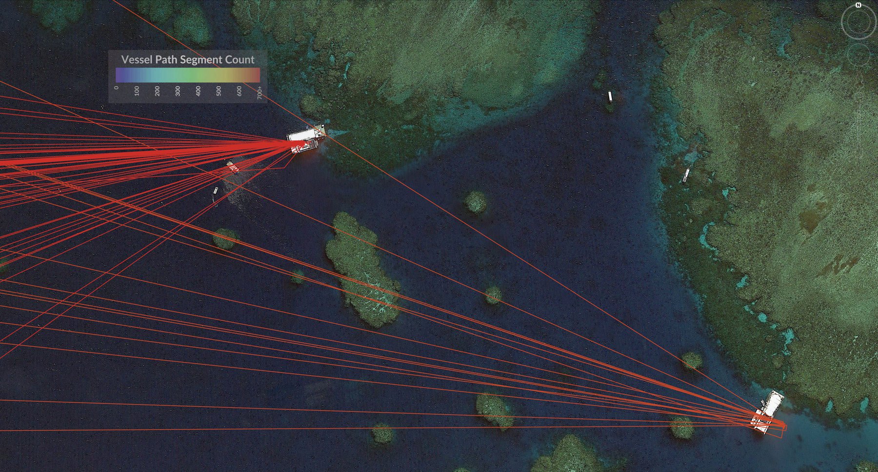

The paths lead to two jetty dive-platforms on the reef, serviced by tourist boats from Cairns Qld. The red path indicates one boat has travelled every day of June. The other path, orange, shows that Vessel has not been as busy. There were some days it did not make the trip. Would this difference affect your decision on which Vessel you might choose?
There are many more interesting paths to explore, but rather than show them all here we'll invite you to come see them yourself in the Data Arena.