| Year | 2025 |
| Credits | Simon PorterVP Research Futures, Digital ScienceVisualisation Developer |
| Links | |
| 3D Stereo | No |
| Tags | N/A |
Australian Institution Co-authorship Collaboration Patterns
On the 4th of March 2025, as part of the Digital Science Showcase, a visualisation of co-authorship patterns between Australian institutions was developed and presented at the UTS Data Arena. Over 60 attendees were split into multiple groups with presentations led by Simon Porter: VP Research Futures at Digital Science
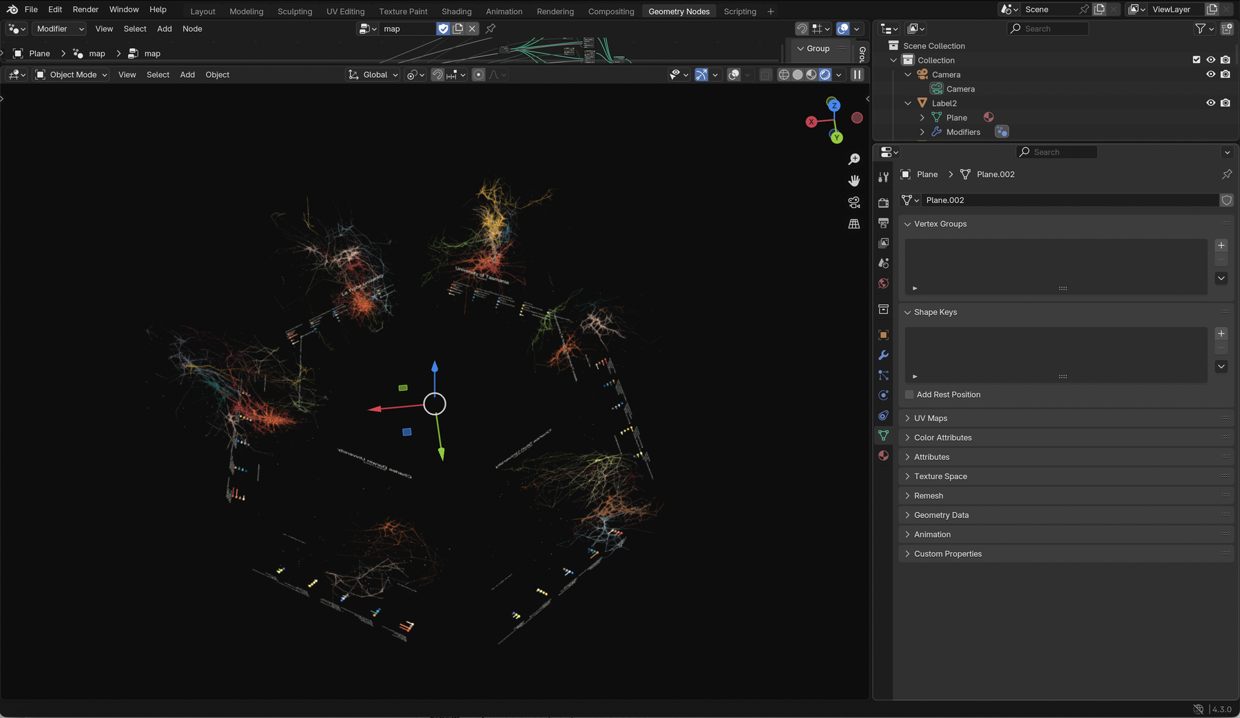
About the visualisations
The networks represent a connected graph of co-authored researchers affiliated to Australian institutions from 2018–2023. Each researcher has been colour coded by the 2-digit FoR 2020 code they are most associated with. Each researcher is depicted by a sphere, and given a size based on the number of publications produced.
Graphs were visualised in 3D space in Blender. A single co-authorship graph for Australia was created, and then replicated 5 times in a circle, with each instance filtered by institution using geonodes. The presentation in the Data Arena is based on the uploaded animation.
To make the network easier to read, collaborations between clusters are not displayed, although they do play a significant role in the layout of the network. Clusters are colour coded by the most dominant discipline of the researchers within them, and are given a ‘height' based on the discipline that they proportionally belong to. Biomedical and Clinical Sciences clusters sit at the base of the network, with Language, Communication and Culture sitting at the top
Technical display
Simon's visualisations were produced at a 1:1 resolution for the Data Arena's display. Each PNG image was rendered at 31550 × 3840px (121MP). These were displayed as a series of slides using the open source MPV media player, which is able to take advantage of our powerful graphics resources. Each image slide could be toggled with a generic clicker, appearing as a typical presentation but at an extremely high resolution.