Adding Context
Our visualisation is functioning well now, but we could do with some more information about it. Create three more font nodes in your legend geo node. One for our title, subtitle and footer. Feel free to name them to avoid confusion too. Here’s that image again that we’re aiming for (we’ll get to the month names a little later).
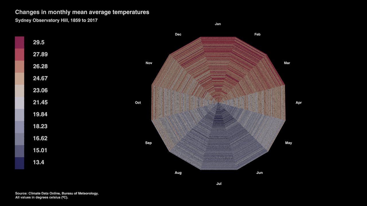

Attach each to a transform node and use these to place and size them accordingly. Output each to our merge node so we can see everything at once. See those years in the subtitle? Since we have our start and end year parameters, why not connect them to that font node and have some dynamic text in our visualisation? Keep “Sydney Observatory Hill,” and head back into your circle geo node and copy the start year parameter from your control node (right click). Paste the copied relative reference and try and achieve the subtitle like above. (Remember: backticks!)
If you’ve gotten stuck, you’ll want something like this:
Sydney Observatory Hill, `ch("../../circle/control1/start_year")` to `ch("../../circle/control1/end_year")`
Just as a reminder, those backticks allow us to separate expressions from regular strings in Houdini. Try shifting your year parameters now and see if the text updates. You should now have a network in your legend geometry node that looks somewhat like mine:
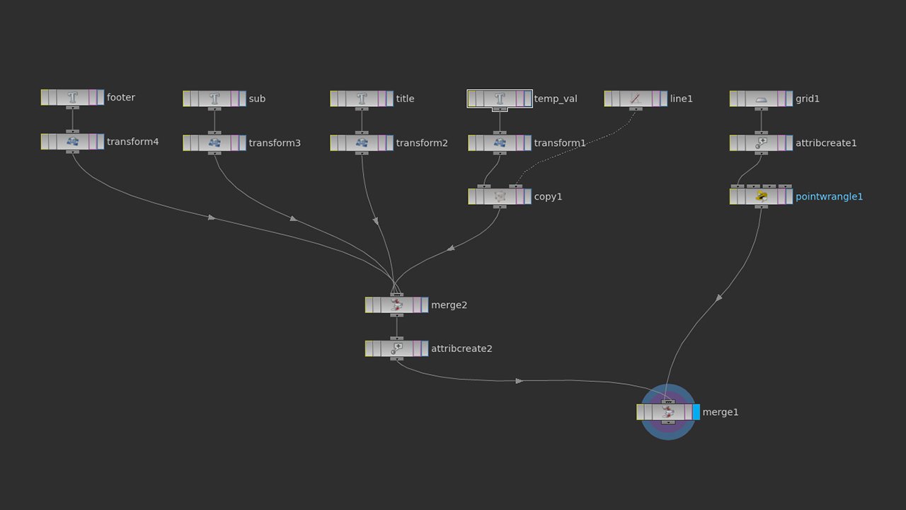

Current legend network view
As a last step for this tutorial, let’s add another text element to identify which months we’re actually looking at here. I would recommend doing this in the visualisation geometry node rather than alongside our other legend elements as we want them to move independent of the camera.
Create a circle independent of your other nodes with 12 divisions. What we’ll do is use this circle’s points as the base geometry for our labels. Don’t worry about the size of it just yet, let’s just get some month names around the edge first. Connect your circle to a transform node (you’ll come back to that later), then onto another point wrangle SOP. We’ll use this to write a VEX snippet to assign some month names to our points in a new attribute. Here’s the code I’ve written:
string month_names_short[] = { "Jan", "Feb", "Mar", "Apr", "May", "Jun", "Jul", "Aug", "Sep", "Oct", "Nov", "Dec"};

string @mon;

@mon = month_names_short[@ptnum];
Have a close look. Basically, we’re just creating a string array of month names to reference. Under this, we establish a new attribute called “mon”, and then let Houdini know that for each point coming from our circle, the value of “mon” is equal to the position of that point in the array. You can read more about VEX and what’s happening here. Now have a look at our geometry spreadsheet.
Yet again we find that we need multiple instances of a single object (in this case a bit of text), each doing something differently. You’ll probably know what to do already. Create a font node and connect it to input one of a copy node, and connect the point wrangle node we just created to input two. What we need in this case is a way to tell our font node to reference each of our month names as we copy it, so we’re going to stamp again. Make sure “stamp inputs” is checked in the copy node and create a new variable “num” that has the value of $PT (the point number coming from our circle). Now we need a way to tell our font node to grab the right value from our “mon” attribute, using the current number from copy.
Remember the point() function? We used point previously to grab the right piece of data from our table, so now we need point to pull the correct string from “mon”, using a position from copy. So for point this time we’re going to reference our point wrangle node, and for the position we’ll use the stamp expression and target “mon”.
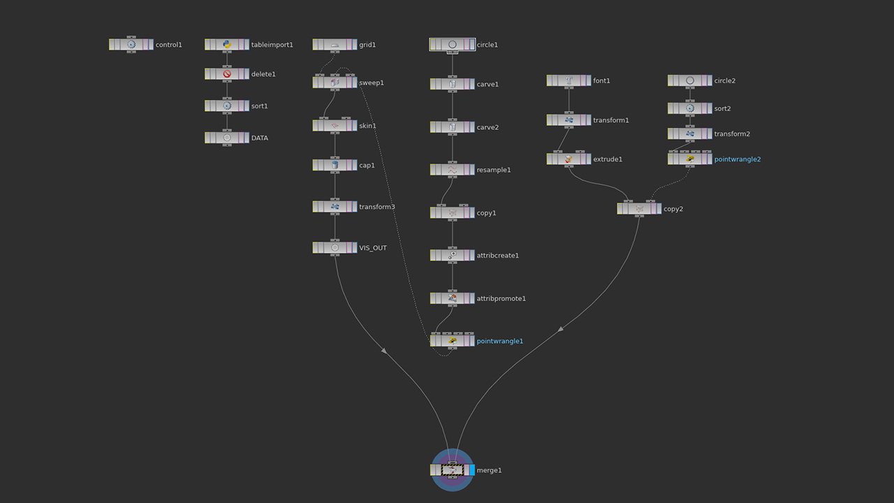
`points("../pointwrangle2",stamp("../copy2","num",0),"mon")`
Great! You should now see our month names spread around this circle geometry. You might need to add a transform node after your font mode to flip your text 180º so it’s facing up with your visualisation. To see both at the same time, connect your copy node and the end of your visualisation chain (probably cap) to a merge node. I found that my visualisation read anti-clockwise, so to fix this I added a sort node after my month name circle to reverse the point order. You may also need to add a transform node at the end of your visualisation chain to rotate the entire graphic so January starts at 12 o’clock (and adjust your month name’s accordingly). Here’s what my final visualisation network looks like:
