Adding a Reference Key
While we are successfully visualising temperature data, it isn’t very legible without a reference key/legend. Let’s think about what else we need. Firstly, we’ll need to see the colour scale we’re using and most importantly the temperature value each colour represents. Secondly, it’s worth having a title and other necessary information about the data, and thirdly, all of this should stay still on the screen while we rotate our view of the graphic.
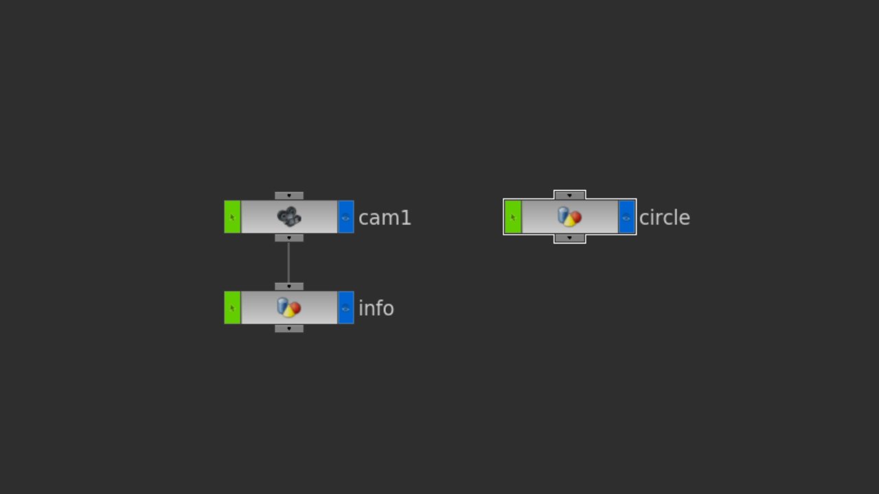

Current network at the scene level
Jump out into the scene view (/obj) and create a camera and a geometry node. We’re going to store our key and all info in the geometry node (called info here) and connect our camera to it like a regular node. The geo node is now a child of the camera, so any transformations made to our camera will follow to its child.
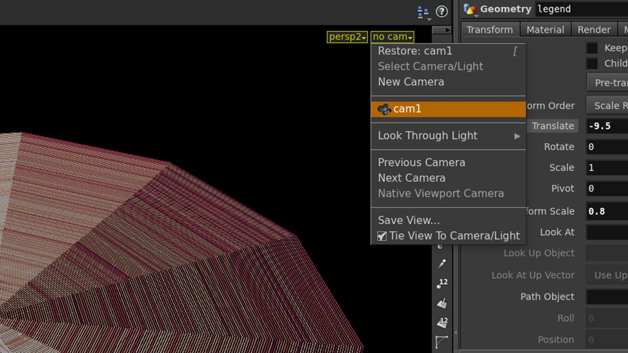

Camera menu in the viewport
In the top right of your scene view, switch the viewport to cam1. We’re now looking through the camera we just created. In the same menu, select “Tie view to camera/light”, so now our camera position will be updated with the standard Houdini orientation controls via the mouse. Jump into the geo node and experiment by editing the size and position of the default geometry box. Try and place this box in the top left corner, and notice how its position remains even while switching perspective on our original graphic. (You may have to first translate its z-axis to the negative to pull it away from the camera!)
Let’s start working on the colour scale visual. Jump inside the geo node, delete the default file and create a grid primitive. We’ll use this to create a strip of colour blocks. Since we have our colour information already from the VEX code before, we’ll go about colouring it the same way. We have 11 colours in total, so we’ll need a grid with 11 primitives (hint: 12 rows, 2 columns).
Remember, while you’re looking through the camera, the geo object will move with you, so if it’s behind you won’t ever see it. Try jumping between the camera and the perspective viewport to get a better understanding of where things are in your scene.
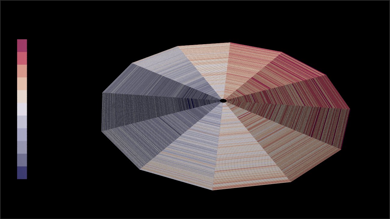

Create an attribute called “square” coming from your grid, and give it a primitive class. We just need this attribute to identify which square/primitive we’re targeting, so we can use the variable $PR as its value which will return the primitive number. Just like before, let’s add a point wrangle SOP to the end of this, except this time we’ll be running over primitives. Here’s the code for our VEX snippet:
vector col_values[] = {
    {103,0,31},
    {178,24,43},
    {214,96,77},
    {244,165,130},
    {253,219,199},
    {240, 230, 255},
    {170, 170, 210},
    {120,120,170},
    {90,90,130},
    {40,40,80},
    {0,0,40}
};

int i = int(fit(@square, 0, 10, 10, 0));
@Cd = col_values[i] / 255;
Look familiar? Try and spot the differences between this block and the previous code that coloured our visualisation. Our colours are identical, of course, but this time we’re fitting our new attribute @square which is a primitive number, rather than a temperature, and reversing it so we’ll see the red end of the spectrum first.
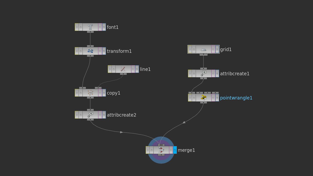

Network of colour scale (right) and future typography (left) joined with merge
You should have the right part of this network setup and functioning. To draw the associated temperature values next to each colour block, rather than manually creating 11 font nodes, let’s just use a copy SOP, and because we know we want our text running down a line we can use a line SOP to give us our locations. Start by just getting some text in your scene with a font node in the same geo level. You might want to run this into a transform sop to let you position easier.
Somewhere else in your scene, create a line and make sure it has 11 points. We’ll use each of these points to position our text by connecting it and the output of our transform (or font) node to another copy node. You should have something like the system above.
What we need to do in the copy node is set up a system in the stamping panel that creates a variable for us to interpolate between the minimum and maximum temperatures and print the value at each point from 1 to 11. By now you’ll probably see your font node text repeated eleven times. Head to the stamp panel of the copy node and create a variable, let’s say “typos” for temp position, and a value of $TPT, meaning template point number, coming from our line. Tick “stamp inputs”, and now we can use “tpos” to access our line’s points, so let’s head back into the font node and write an expression that will fit the current number to our temperature scale.
To access copy’s stamping, we use the stamp() function which expects a link to the node, the variable we want and a fallback value (if things don’t go so well). This will return 0 to 10, so we’ll use fit() again to re-scale.
`fit(stamp(“../copy1”, tpos, 1), 0, 10, 13.4, 29.5)`
Notice the backticks surrounding our expression. Because we’re entering this into the text parameter of our font node, by default it will treat any text as a string and display it. The backticks tell the parameter to treat anything within them as executable code rather than text. Try removing the backticks and see the result. Play with the font node’s text size, transform node’s position parameters and the line node’s length to display your type properly.
Great! Now just connect the ends of your typography and grid networks to a merge node to see them both at the same time. Go ahead and use a few more font nodes to give your visualisation a title and source. You might find that the merge node throws a warning when you connect these two networks together. This is due to the mis-match of attributes as our grid/colour scale network is generating “square” and Cd attributes, while our typography doesn’t contain any of this, so Houdini generates a colour automatically. This is fine to progress with, but if you’d rather remove the warning, you can duplicate that attribute create node for the type network and create another “Cd” attribute within it to compliment square.