Using VEX Wrangling and Colour Thresholds to Reveal Information
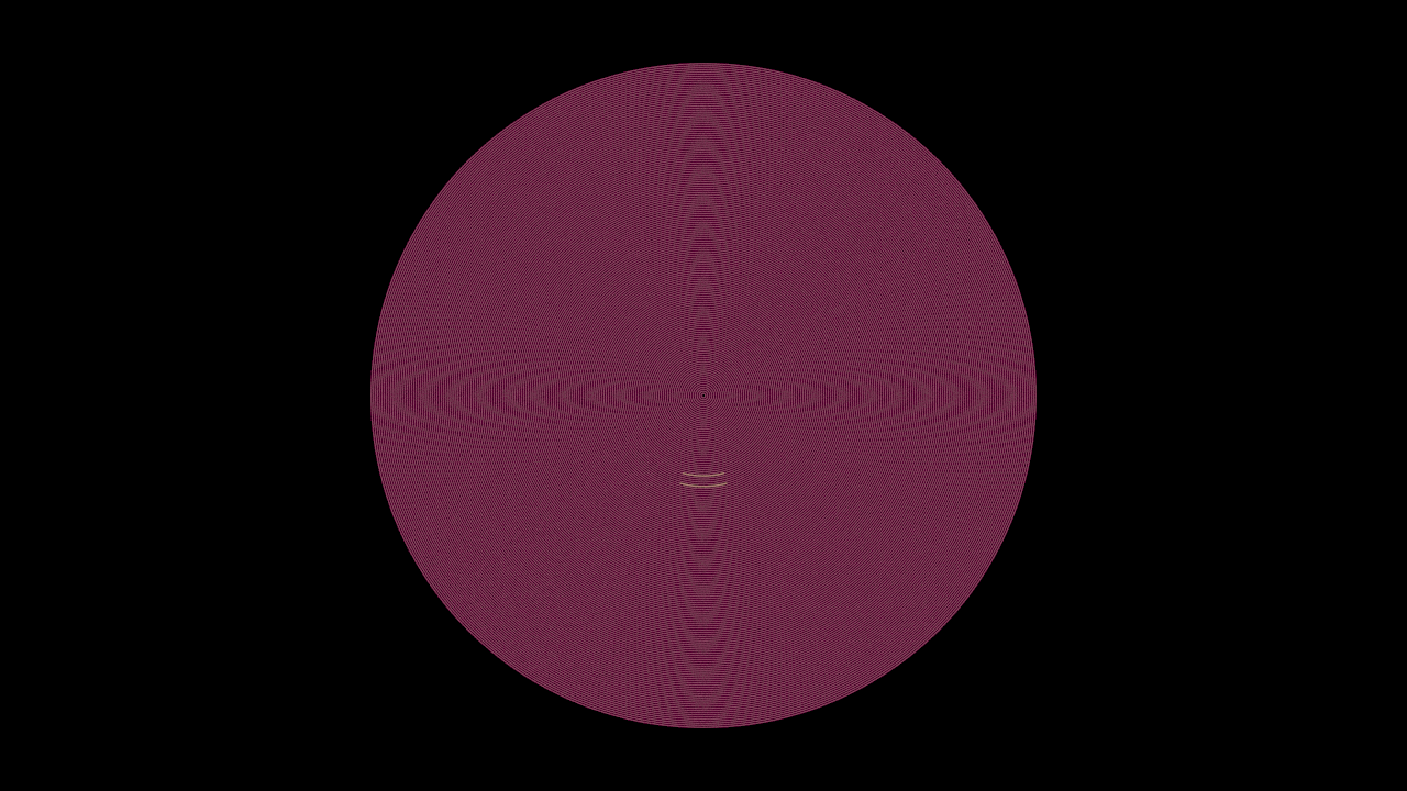
Often data visualisation is a two part process, focused first on importing and displaying information and secondly tweaking the formal output for legibility, aesthetics and/or highlighting specific detail. This brief tutorial follows the previous lesson on displaying tabular data in Houdini to look at using colour ramps and the point wrangle node to add flexible colour control to our data. We’ll also take a look at how tweaking our colour parameters can expose data that might be otherwise overlooked. It’s always best to approach visualising data with questions in mind, but sometimes it’s helpful to start seeing first to prompt further inquiry.
We’ll be working off the output of the previous tutorial, so either pick up from there or have a file prepared with a point attribute of varying values. Our previous tutorial stored temperature data in a “t” attribute:
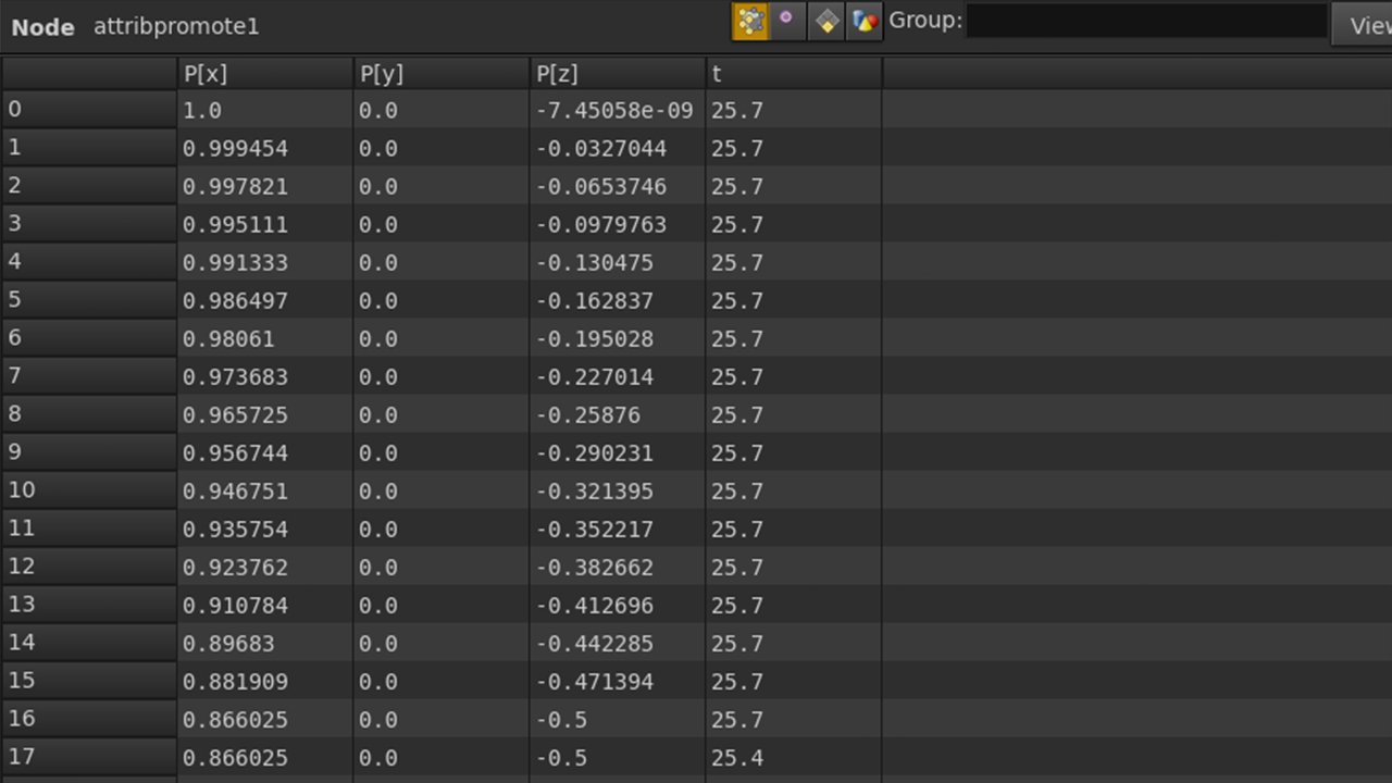
Geometry spreadsheet, points view, attribute promote selected