Setting Up
Currently, we have a point wrangle node in our network that is storing eleven colours in an array. We then take a look at the temperature attached to each of our points to see where it fits within this scale and colour it accordingly. It would be far more useful to be able to modify our colours without having to edit an array, and to also be able to change the amount of colours in our scale and their position. To do this we need a new control element. Head into your control node, or create one, and add a color ramp parameter. As it suggests, we can use this parameter to create a linear colour scale with any number of colour options.
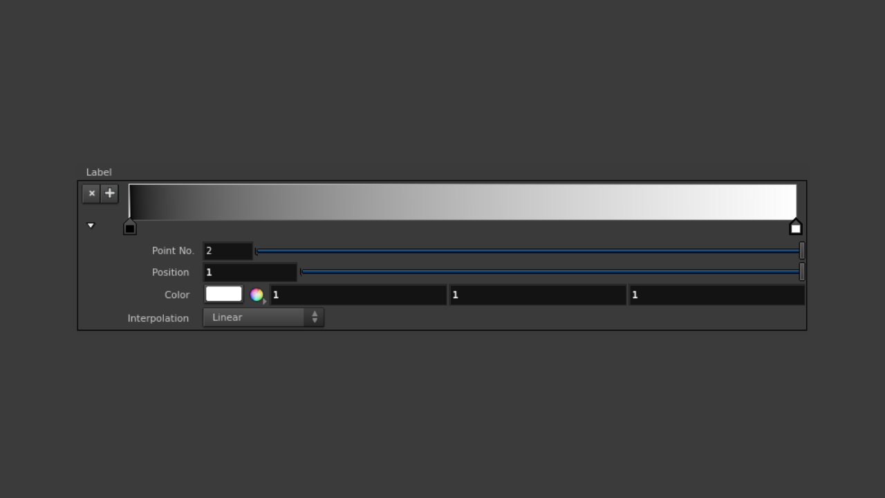

Default colour ramp parameters
Try shifting a few parameters around and get a feel for how the linear gradient is formed with colour points and their relative positions. Create a gradient with two or more colours that you feel will be appropriate for the data. Here’s what I’ve started with:
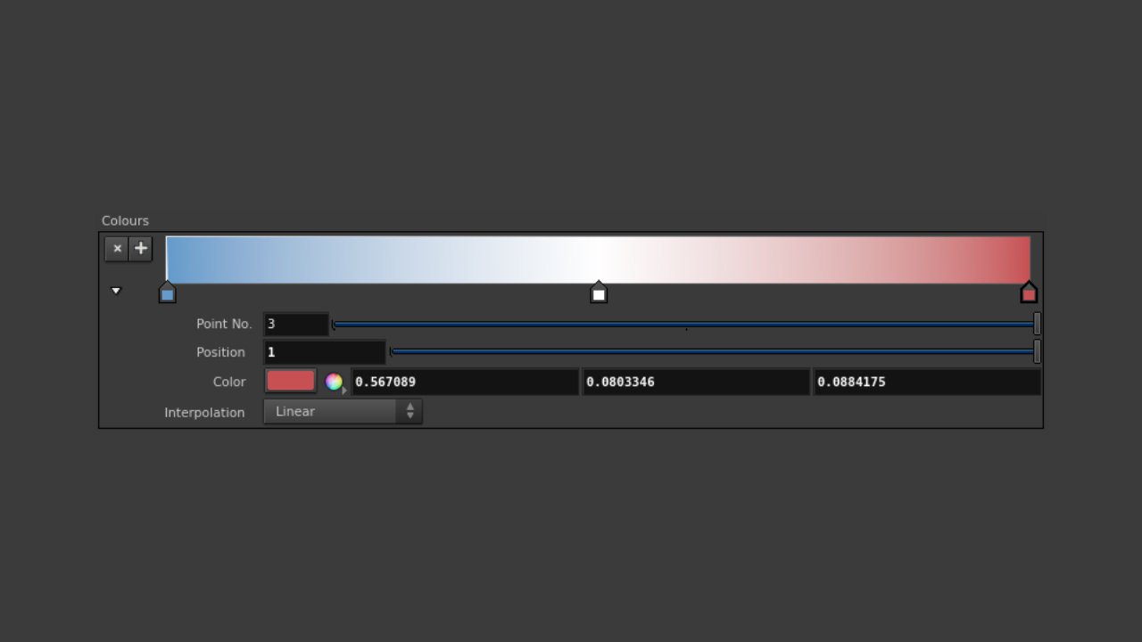

Three point colour gradient
Now we’re ready to have our point wrangle node start talking to our colour ramp. Jump into the VEX snippet and refamiliarise yourself with the code. We’re going to use the value of @t (fit into a new scale) to grab a point on our colour ramp/gradient, so what can we do without? All we really need to remember is to use our @t attribute syntax, and the fit() function for rescaling, so we can remove the rest.
To communicate with our colour ramp parameter, use the chramp() expression function. This function needs a few simple details: a path to the parameter, a position in our colour scale to read from, and (optionally) which component we’ll be reading (R, G, or B). We need to write an expression that assigns the returned value of the chramp() function to the colour of the current point (remember our point wrangle node runs over all points). Have a go at doing this yourself.
Hopefully you’ve worked this one out, but if not, this is what we’ll need:
@Cd = chramp("../control1/colours", fit(@t, 13.4, 29.5, 0, 1));
Here we have the current point colour attribute @Cd assigned the returned value of chramp(), which is reading from our control node, and its position is determined by our temperature attribute @t re-scaled to fit between 0 and 1. You should now see your data coloured according to your colour ramp parameter. (Remember to call your parameter by its name not label) Try changing these colours now and also adding more of them for more detail.
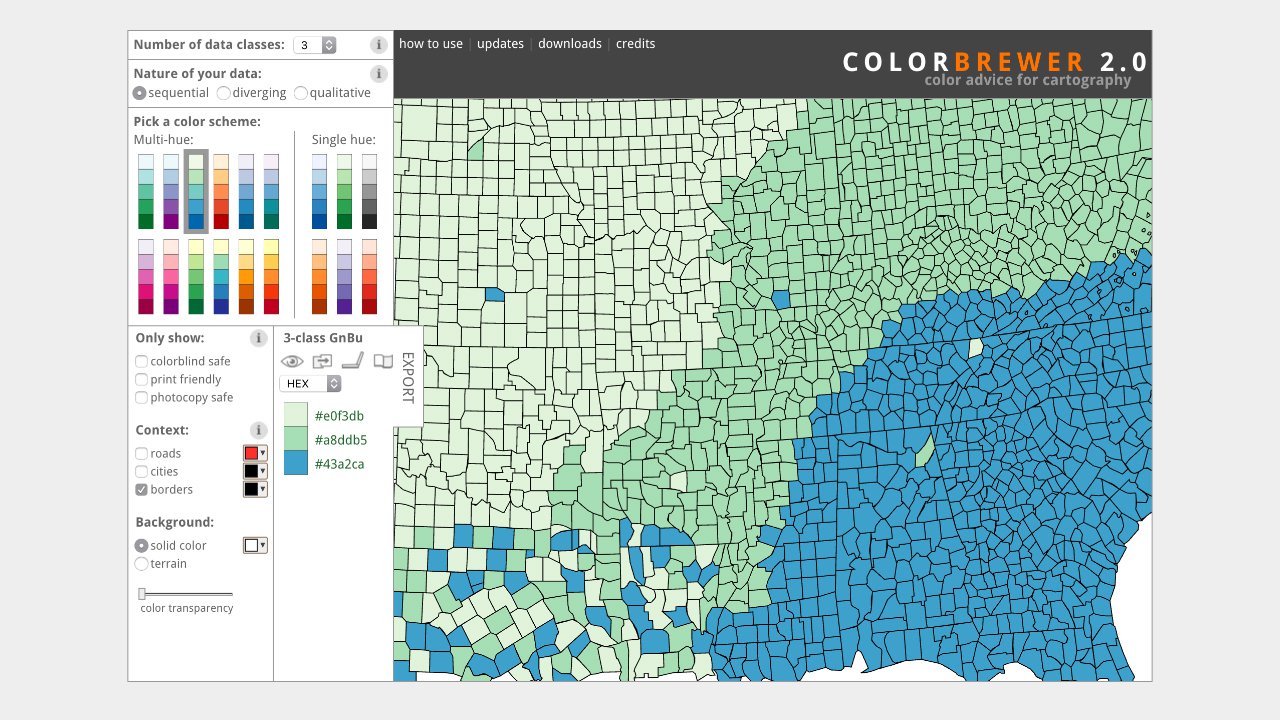

http://colorbrewer2.org/
Color Brewer can also help you design a colour system that you think is functional and appropriate, demonstrating the difference between sequential, diverging and qualitative colour schemes. Pay close attention to how each of these systems could be useful for temperature data and what may or may not be best visualisation practice. Consider how important details like neighbouring differences and patterns/trends can be either elevated or demoted in the process.