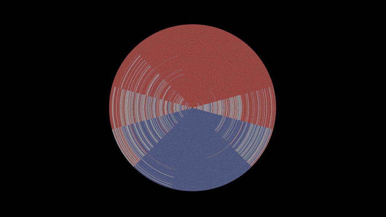
Thresholding
Increasing or decreasing the colour contrast threshold can reveal interesting details in your data. To experiment with this, try working with three colours (two on the outside, one in the middle) and changing the positions of each on the gradient. What happens if you pull the outer-colours towards the middle of your scale? Or shift colours towards one side? Pay close attention to the visual outliers in the visualisation as you change these parameters. What details begin to show up? Are there any extremely hot or cold months that become visible, and when did these occur? Focus on the turn of the century, around the period of the Federation Drought. Is there a notable difference? Below is the result of gradual increase in contrast and the details that become visible.
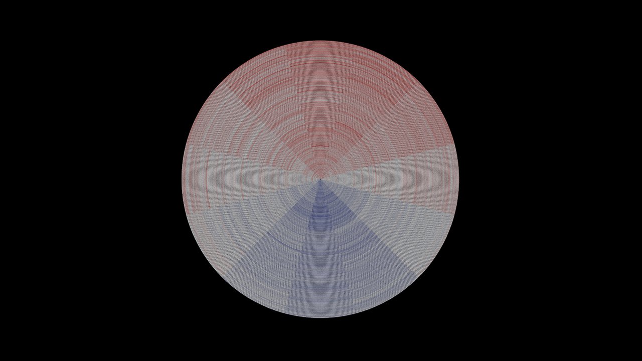
Colour ramp point locations: 0.0, 0.5, 1.0
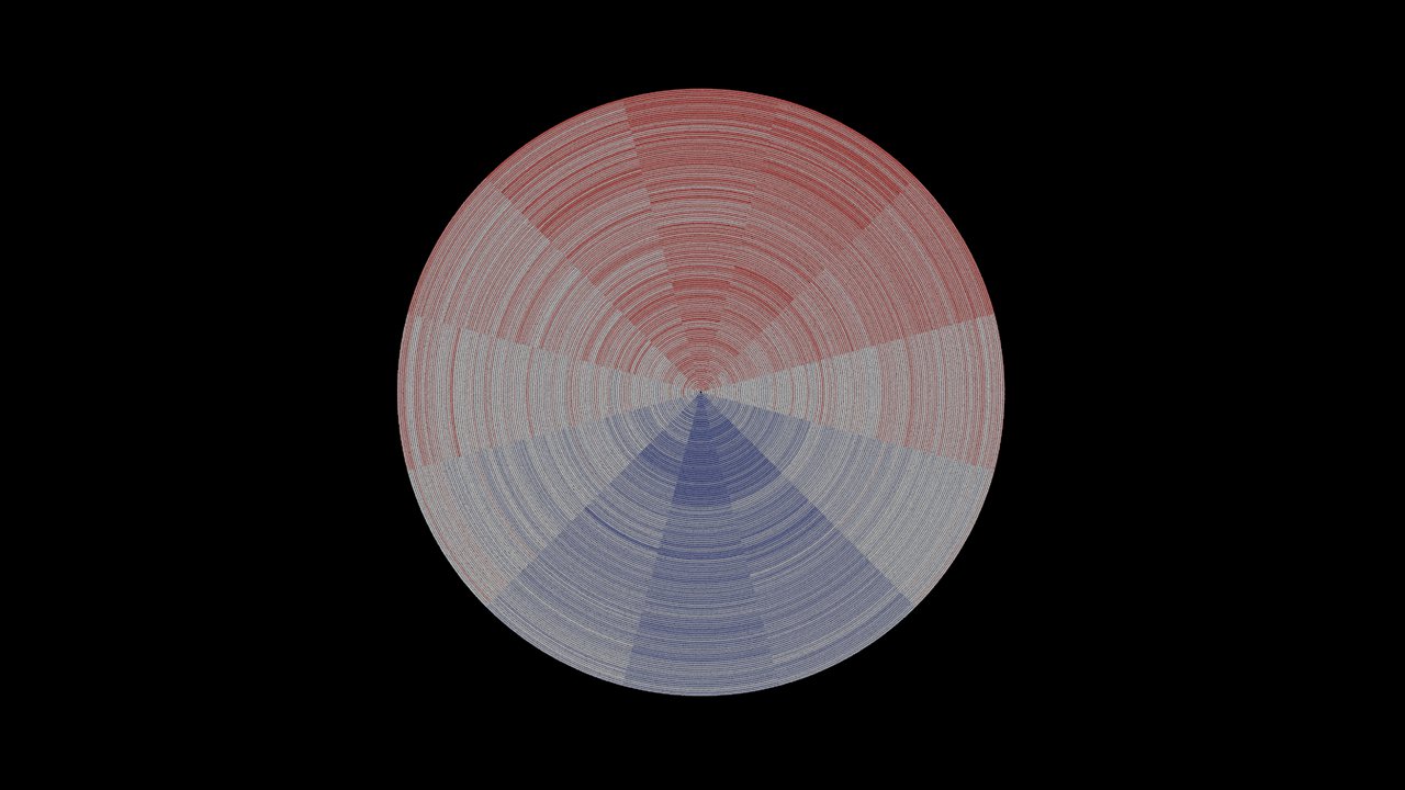
Colour ramp point locations: 0.1, 0.5, 0.9
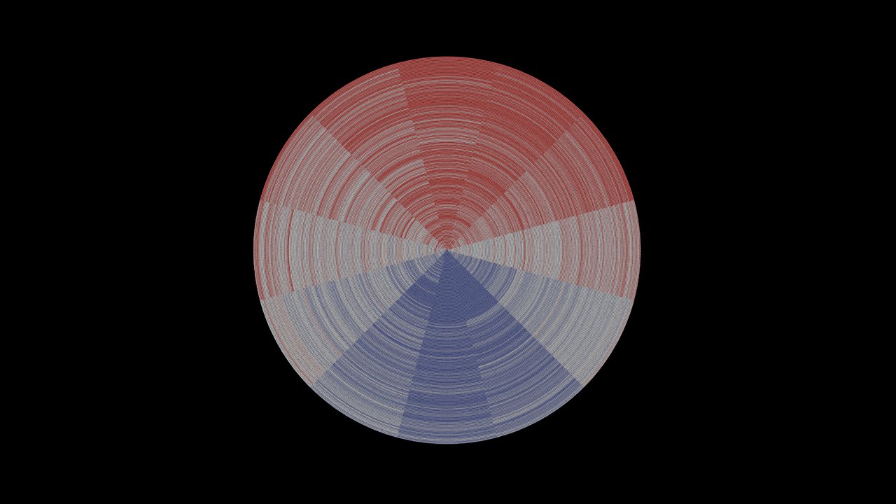
Colour ramp point locations: 0.2, 0.5, 0.8
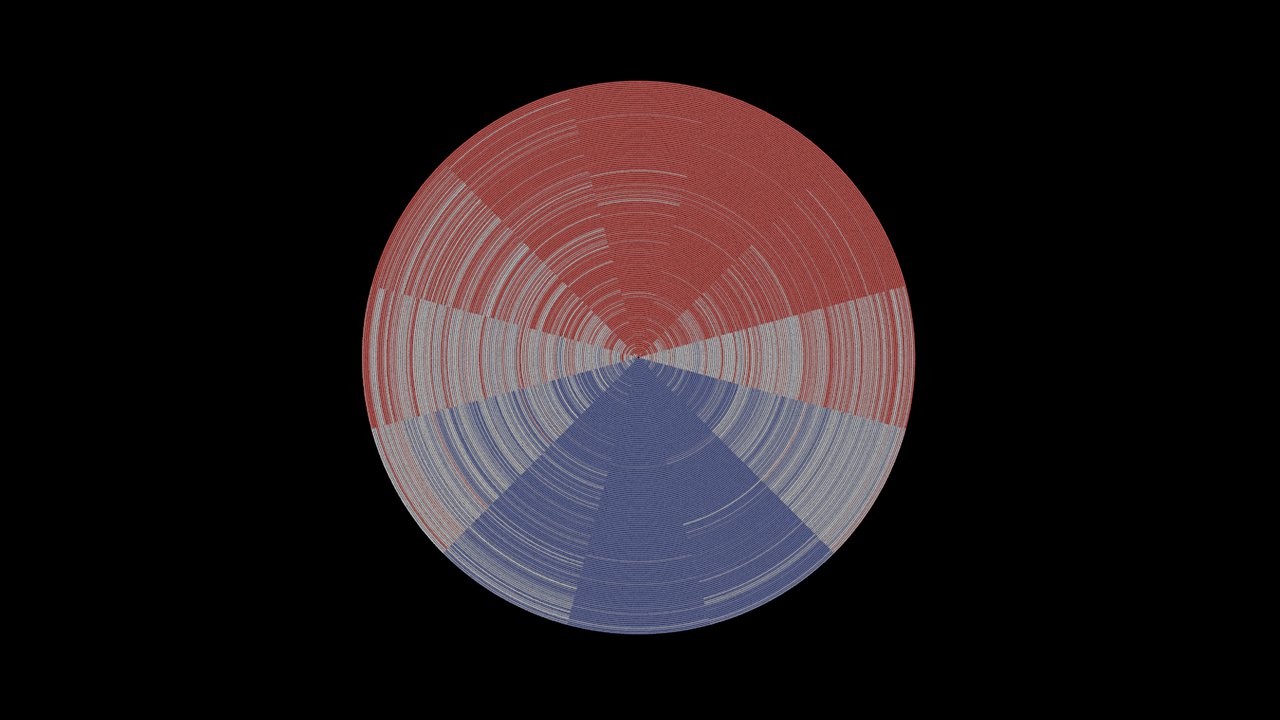
Colour ramp point locations: 0.3, 0.5, 0.7
Colour ramp point locations: 0.4, 0.5, 0.6
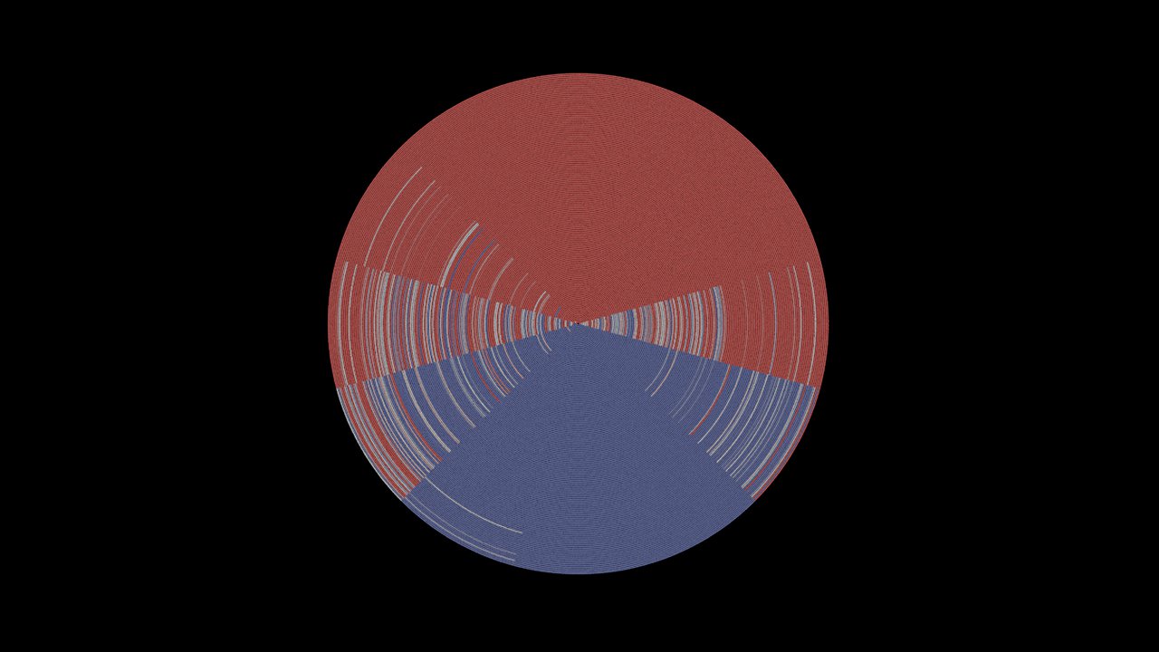
Colour ramp point locations: 0.45, 0.5, 0.55