Visualising Clustered Data

Introduction
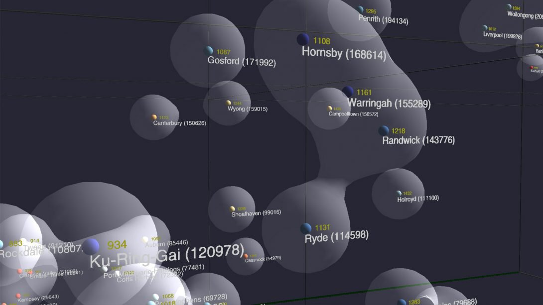
In this tutorial, you will learn how to visualise clustered data sets using Houdini and Omegalib. This guide will make use of the clustered data pipeline which was also used to create the 3D Human Services Data Hub project included in the DAVM. The clustered data pipeline allows you to visualise three dimensional data sets and discover relationships between samples based on their spatial proximity with one another.
You can find the resources used in this tutorial within the /local/examples/hsdh folder inside the DAVM.
Loading The Asset
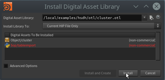
To begin, launch Houdini, or create a new empty scene if you already have a Houdini session up and running. Ensure you have access (see the installation guide for assistance if you have not yet configured the virtual machine for file sharing) to the cluster.otl asset included in the HSDH example project within the DAVM (i.e., inside /local/examples/hsdh/otl) and load it into your Houdini scene.
To load the asset file:
- Select Assets -> Install Asset Library from the main Houdini menu
- In the dialog that appears, enter the location of the cluster.otl file
- Press the Install button to add the digital asset to your current scene

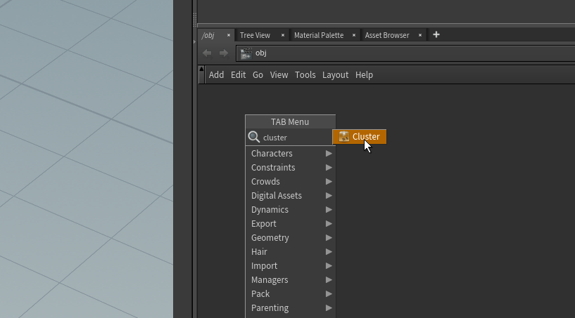
Now, create an instance of the cluster asset inside the object pane (lower right panel of the Houdini UI):
- Switch focus to the object pane
- Press the
tabkey to bring up the node selection menu - Type cluster and then press the Enter key to select the correct asset node
- Click within the object pane in order to place the new node

Configuring The Asset
With the asset node in place, we can now edit its settings to configure the data set to display, and the properties of the resulting visualisation. Once again, we’ll make use of the HSDH example project, and load the included HSDH_example.csv file into the asset.
To load the example data into the asset:
- Switch focus to the object properties pane (upper right panel of the Houdini UI)
- Select the tab labeled Cluster
- Edit the field labeled CSV File and set it to the location of the HSDH_example.csv file
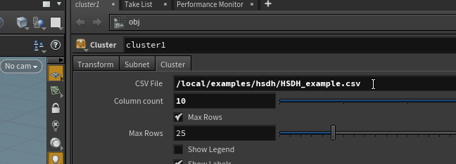

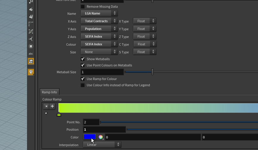
Now that the data has been loaded, we can map different columns in the data set to the axes in the visualisation geometry, and configure the other display properties:
- Switch on the Show Legend checkbox
- Use the Name drop-down to select LGA Name
- Use the X Axis drop-down to select Total Contracts
- Use the Y Axis drop-down to select Population
- Use the Z Axis drop-down to select SEIFA Index
- Use the Colour drop-down to select SEIFA Index once again
- Adjust the colour selection for the Colour Ramp control points

Exporting The Geometry
Our visualisation has now been populated with data, and we have configured the desired display settings. The next step we need to take is to save a copy of our scene file (so we can come back later and make further adjustments if needed) and export the visualisation geometry so that we can then load it up using Omegalib within the DAVM.
Here is what you need to do:
- Select File -> Save As to open the file save dialog
- Choose a destination location and filename for the scene, then press Accept to save the scene
- Once the file has been saved, return to the object properties pane
- Scroll down and select the File Output tab
- Press each of the Save … to Disk buttons in turn to write out the three geometry components which comprise the visualisation
- Transfer the three geometry files created into a shared folder so they are visible to the DAVM


Visualise Using Omegalib
The final step is to modify the DA_HSDH.py file (or a copy) included in the HSDH example (i.e., inside /local/examples/hsdh), and update the geometry object paths (i.e., the values of fileToLoad, isoFile and townFile in the code snippet below) to refer to the geometry files you exported and shared with the DAVM in the previous step.
# Paths to objects
basePath = os.path.dirname(os.path.abspath(__file__))
fileToLoad = basePath + "/opaque.ply"
isoFile = basePath + "/transparent.ply"
townFile = basePath + "/labels.ply"
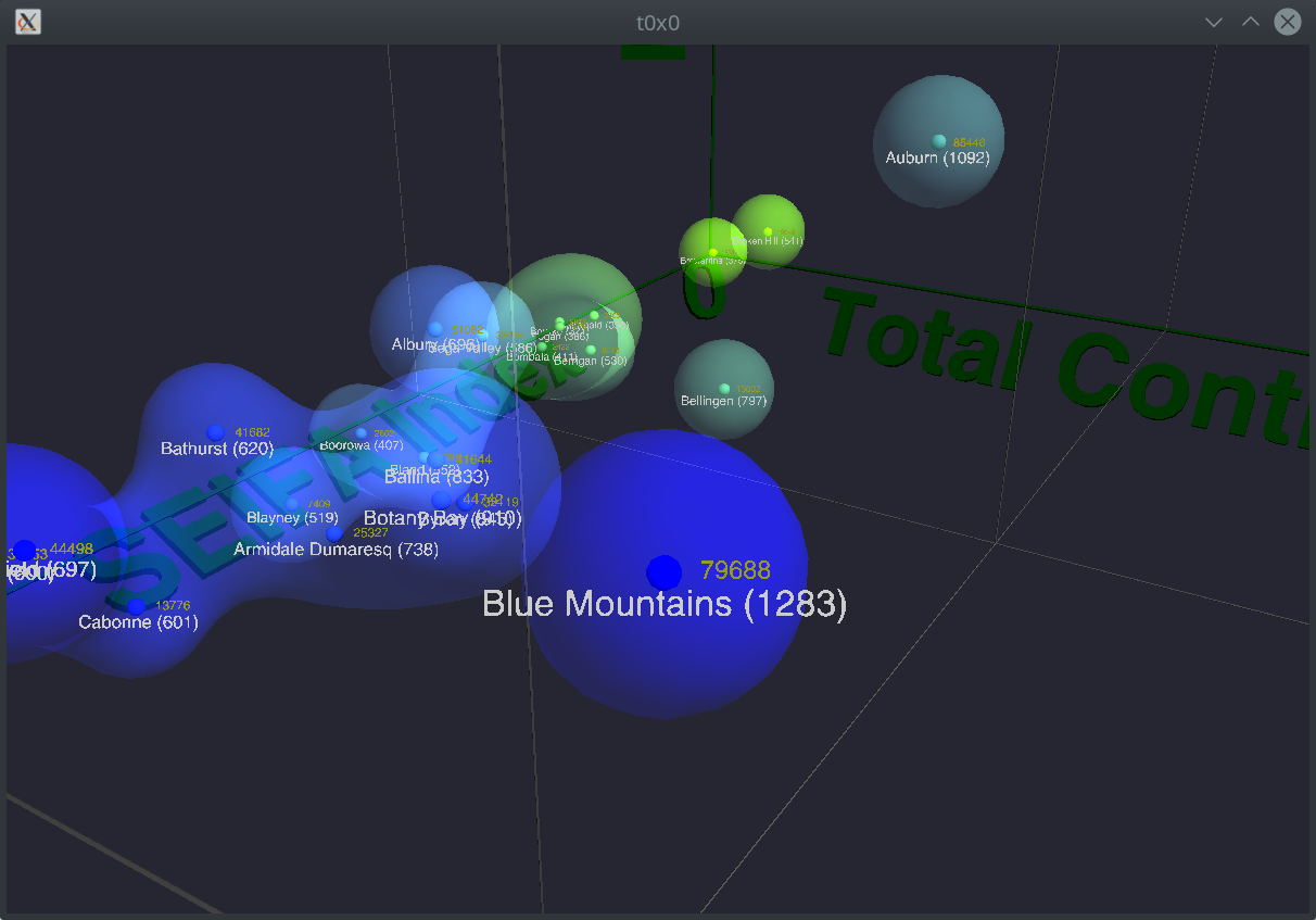
Once you’ve updated the file, launch the demo in a Terminal window using the orun command, and use Omegalib to “fly” through your visualisation:
cd /local/examples/hsdh/
orun ./DA_HSDH.py
You should see something like the example shown below:

Where To Next?
Now that you’ve mastered the basics, here are a few suggestions for the next steps which you may like to take in your exploration of clustered data:
- Experiment with some of the other settings on the cluster asset in Houdini and observe the outcome
- Try using the pipeline to visualise your own clustered data set
- Dive into the implementation of the cluster.otl digital asset in Houdini to learn how it works