Create a treemap
Treemap's are another common visualisation method that Tableau has built in, and might help us understand the spread of COVID19 through a heirarchical display of rectangles. If you aren't familiar with treemaps, it might be best to take a read and then return to this page. For our purposes, we'll try and improve of the previous graph by creating a treemap where each cell/rectangle mark is representative of a country, and its size derived from confirmed cases, as seen below. We'll also implement live filters to control the display of segments and create a small multiples style display of multiple treemaps.
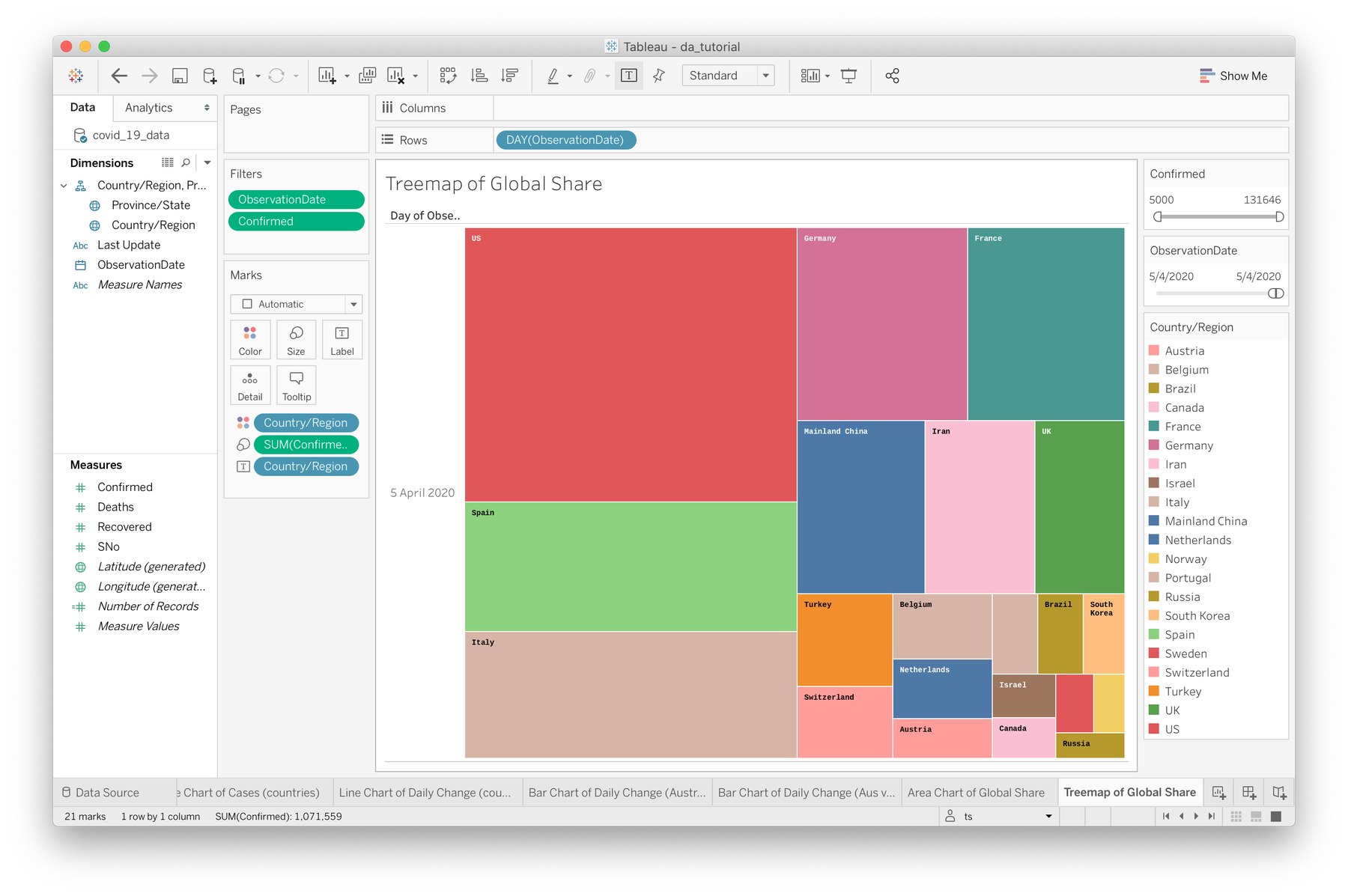

Treemaps are a little tricky to get right in Tableau, but just hang in there!
- Start with a new, blank sheet, named something like "Treemap of Global Share"
- Click on the "Show me" option in the top right corner of the Tableau window, find the Treemap option, and notice how it's asking for 1 or more dimensions, and 1 or two measures. In our case, our dimension will be Country/Region and the only measure we'll be using is our Confirmed field, representing the total cases per country. Each style inside Tableau has specific requirements for it to practically function.
- To go ahead with our treemap, drag Confirmed to the Size option in the Marks shelf. This will look a bit ridiculous as we start. You should see a single square representing every single global case.
- Now drag Country/Region onto the Color option and add all members (we'll filter down later)
- At this point, we can return to the "Show me" menu and select Treemap.
- Tableau has changed things around a little for us, so we need to drag Country/Region back onto the Color option again. Now we're getting somewhere.
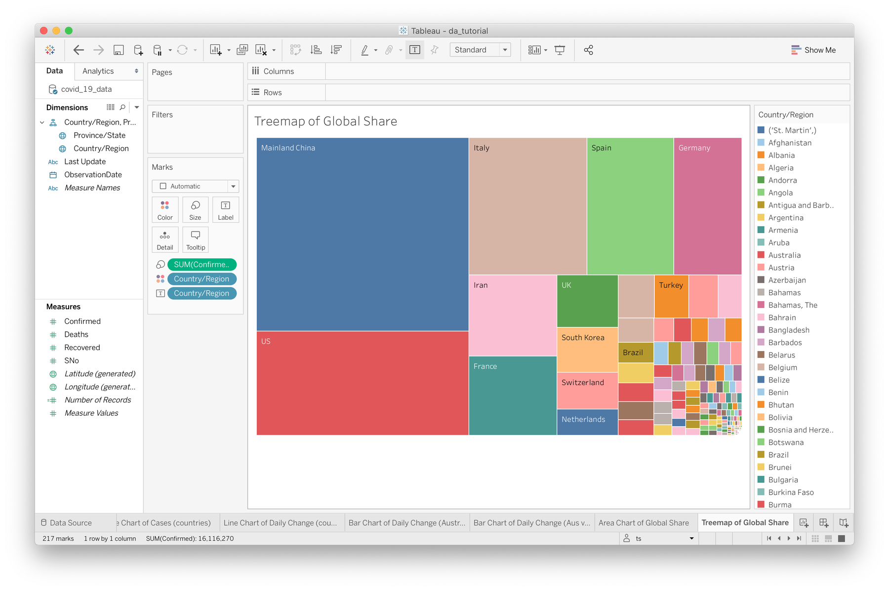

At the moment we're looking at an aggregate treemap of every confirmed case of COVID19 over the entire timespan of our dataset. This is interesting, but I think we'd rather see a time-based breakdown so we can control the timespan we're looking at, so let's introduce another filter.
- Drag OversationDate to the Filters shelf. Select "Range of Dates" and click Next. Use the range slider to select just the latest date. In my case that's a range of 5/4/2020–5/4/2020.
- Now we're looking at the latest day of our data. To easily adjust our time range, right click on the ObservationDate filter and select "Show Filter". Now you'll notice a handy range slider on the right above our Country/Region colour legend.
- The range of cases here is pretty huge so we're seeing a lot of tiny countries, so to focus on the larger outbreaks, let's add another filter. Drag the Confirmed field from the measures section onto the Filters shelf as well. I set the minimum to 5,000, meaning we're only looking at countries with over 5,000 confirmed cases. Like with our date, select **"Show Filter" on this as well to pin it to the right hand side.
Now we've created a tool whereby we can adjust our timeline between days, weeks, months etc, and filter countries by the severity of their outbreaks. We can use this to compare counties at different levels of the outbreak at any timeline (within our dataset of course).
Small multiple display of treemaps
One advantage of the area graph from the previous page was the ability to compare over time within one view. With our treemap we've lost this and can only see one snapshot of time. By utilising the columns or rows functionality of Tableau, we can generate a view of multiple treemaps, each representing a different day. For this next task, we're going to work towards this small multiple style representation of the latest week of data.
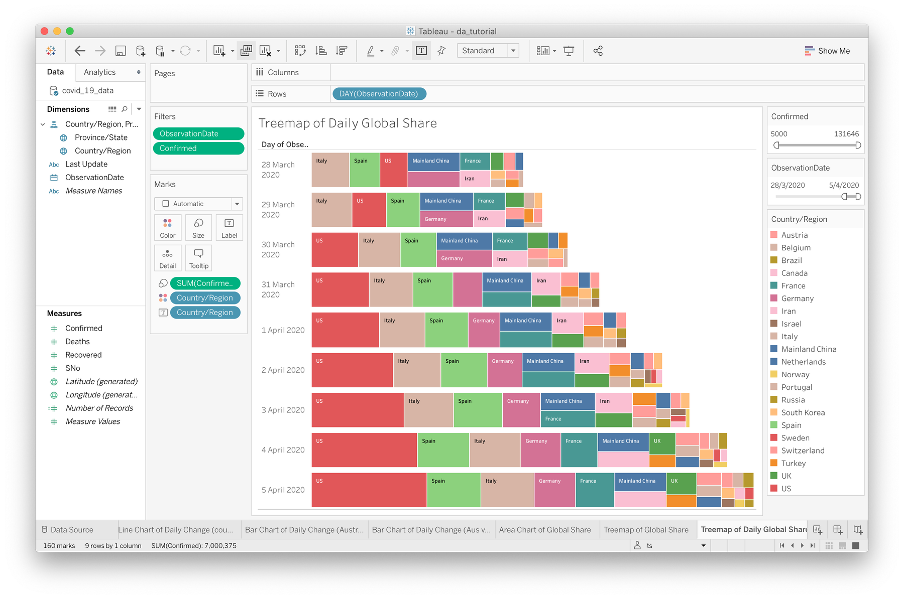

- Duplicate your treemap sheet and rename it to "Treemap of Daily Global Share"
- Drag the ObservationDate dimension field to the rows drop-field above your sheet
- Right-click and switch the representation of the field to the second Day option as we have done for the past few graphs
- Right-click again and set the field type to Discrete
- Now modify your time range filter to include more than one day. You might need to expand your sheet size to fill the remaining horizontal space.
The advantage of this method is that we can make a daily comparison of the global share of COVID19 cases over an elected time period, while still getting a sense of the rise of global cases (evident in how each treemap is longer than the one before it). There are still many issues here—legibility of the country labels to name one—that arise due to the small screen real estate available on a typical monitor.
However, if you're working on a project and would like to see it in the Data Arena, we've got over 10K of available pixels ready to use.
Animated treemaps with Pages
The very last Tableau feature we'll experiment with is Pages. Pages can allow us to step-through (manually or automatically in playback) the timespan of our dataset to visually see how the global share of cases has changed over the past few months. This can be applied to nearly any time-based data representation, and in our case we'll apply it to our treemap. Here's what we'll be aiming for:
To create this treemap that steps through one day at a time, there's not too much we need to do:
- Duplicate the small multiple style treemap you just completed and rename it to something like "Animated Treemap of Daily Change"
- Since we no longer want to see multiple days at a time but rather step through them, drag the ObservationDate dimension off the rows area onto the Pages shelf.
- That's basically it! You'll now see a slider with some time controls in the bottom right corner of your window. You might also want to adjust the time filter to include the last month or so of data. You can also control the playback speed (although fine tuning is limited).