Visualise the Global Share of Cases
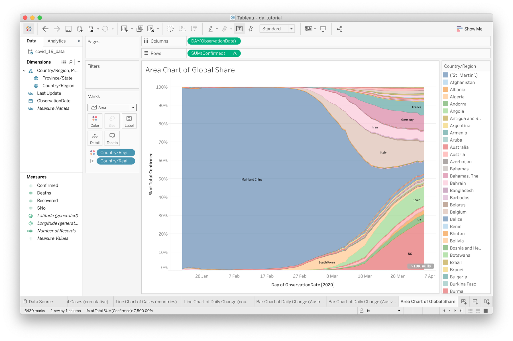
As cases of COVID19 travel internationally, containment measures have been keeping numbers down in some areas while others rise severely. For this next section, we're going to see how Tableau can let us visualise this shift over the past few months. We'll be creating this following area chart which comparies countries over time by assessing the percentage of their cases against the global total.


- To get started, create a new sheet (new sheet button in the bottom toolbar, or Worksheet → New Worksheet) and name it something like "Area Chart of Global Share"
- As with our previous sheets, apply ObservationDate to our columns, and set it's calculation to Day (e.g May 8, 2015). The difference between the two Day options is that one is a descrete dimension, where what we want is a continuous measure (green pill). Try both and compare the difference.
- Drag the Country/Region field onto the Color option in the Marks shelf.
- Drag the Confirmed field to rows. Right click on it in the rows section, and choose Quick Table Calculation → Percent of Total.
- In the same dropdown, switch the Compute Using... option to Country/Region. This means that Tableau will group all unique instances of each country together to be counted (they are separate and repeated in the CSV file).
- Set the Marks style to Area instead of Automatic
- To display the country name on each portion where possible, drag another instance of the Country/Region field from the Dimensions list to the Label box in the Marks shelf.
- To adjust the display of the type label, click Label and go from there.
Here's a video of this whole process:
This design is quite effective at visualising a few things, such as the effect of Mainland China's containment measures and the global spread of cases over time. However, there are a few representational issues to keep in mind:
- Percentages can be misleading. It isn't clear that globally all cases are rising, and this graph could be misinterpreted as representing a fixed number of cases shifting between countries.
- The size of Mainland China's portion looks as if they had a global amount of cases at once, when in fact the first few months were a steady rise which is not visible here.
- Italy's portion looks as if their cases are decreasing in numbers since late March. While their daily rate is flattening, they are still handling 4,000+ cases per day, and their portion is only becoming smaller due to outbreaks in other areas
What else can you see that is working well or problematic? And how could you address these issues? This is an example of how Tableau can let us get up and running quickly, however it's not quite able to address the context of your data and identify when you might be heading down a slippery slope (bad pun intended).