Create a Line Chart
Let's dive in by trying to visualise the collective global rise in confimed cases. We'll use the ObservationDate dimension field as our x-axis (columns) and the Confirmed measure field as our y-axis (rows).
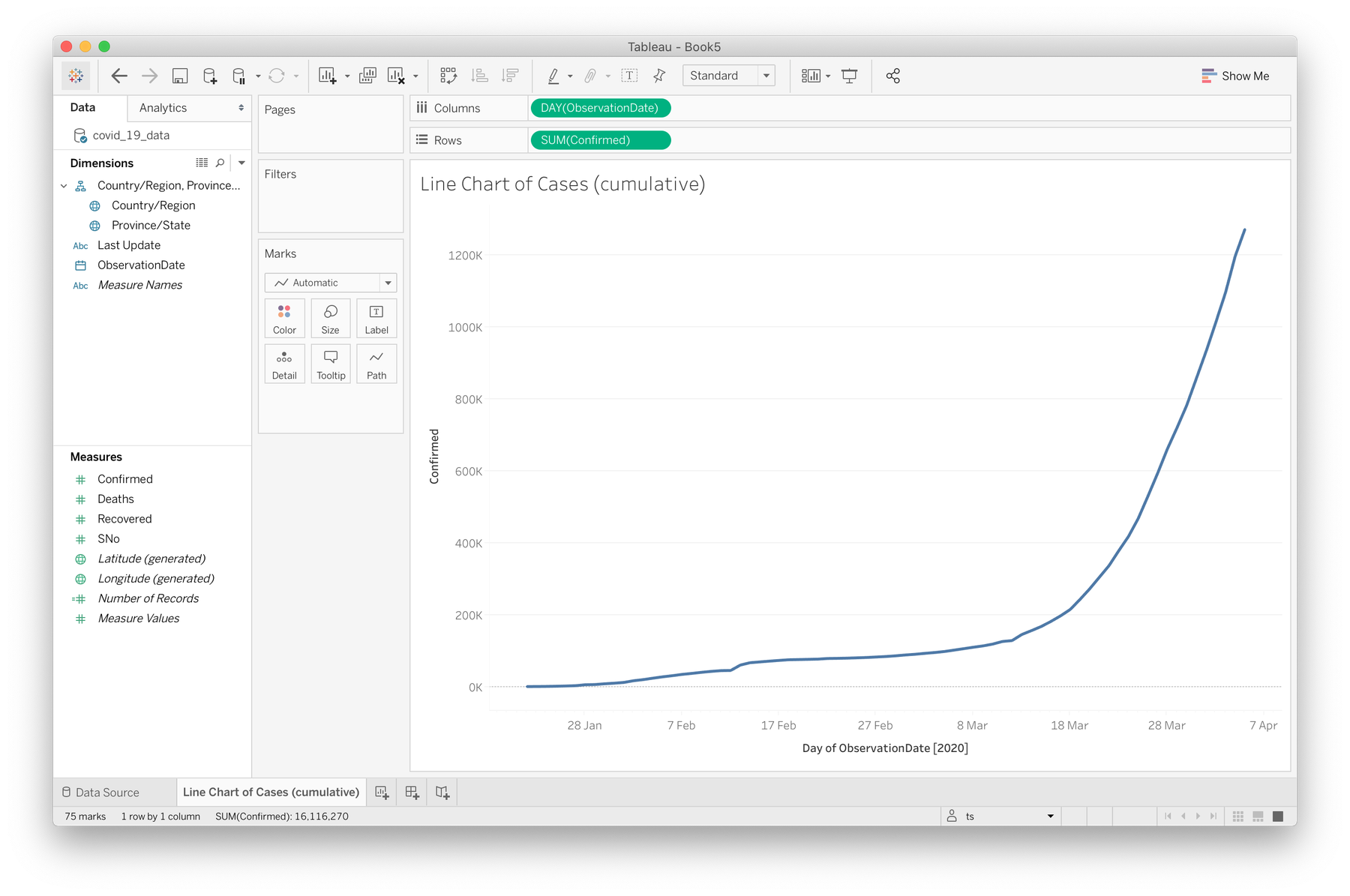

Simple line chart
- Click and drag the ObservationDate field into the columns section above your sheet. This may default to a
YEAR()calculation, so right click on the pill that was created in the columns section and select Day (e.g May 8, 2015) to tell Tableau to show us a day-by-day breakdown. - Now drag the Confirmed field to the rows section.
That's it. Here's a quick video if you got stuck somewhere.
Before we move on, rename this sheet (right click on the tab at the bottom) to something like "Line Chart of Cases (cumulative)". You'll thank yourself later.
Multiple lines per country
Let's now attempt to break this down per country by introducing a line for each unique "Country/Region" in our dataset. We're going to ask Tableau to create a mark for each country.
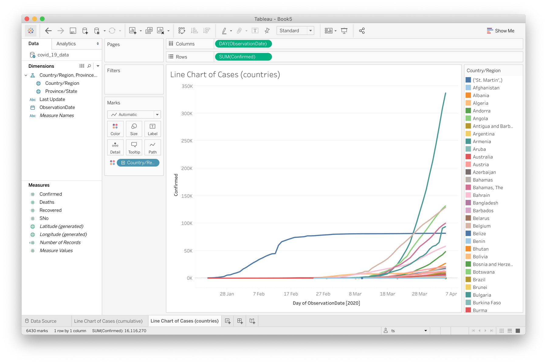

Line chart with line marks per country
- Let's first duplicate this sheet (right click on the tab at the bottom) and call this new one "Line Chart of Cases (countries)".
- Click and drag the Country/Region field onto the "Color" option in the "Marks" shelf
- You might get a warning about the recommended amount of "members". Let's just select "Add all members" for now, but keep in mind that we're generating over 200 separately coloured marks, and for legibility reasons this isn't best practice, but we'll filter down later.
- Click on the "size" option to experiment with line thickness if you want.
Here's a video of this process.
The data I'm using here is up until 5 April, 2020, and a lot has occured in the past month or so. The line representing Mainland China has completely flattened, indicating no/few new cases for weeks as other countries begin to overtake, most notably the US with a terrifying increase rate. What else can you see here?
Note: your colours will probably be different to mine as Tableau randomises the selections. This will probably apply to all graphs from here on if you're confused!
Daily change vs running total
Let's say we're now interesting in visualising the daily change in case numbers rather than a running total. We should expect to see a few large increases for Mainland China earlier in the year, and then a lull before the outbreak spreads internationally with the US leading in severe increases.
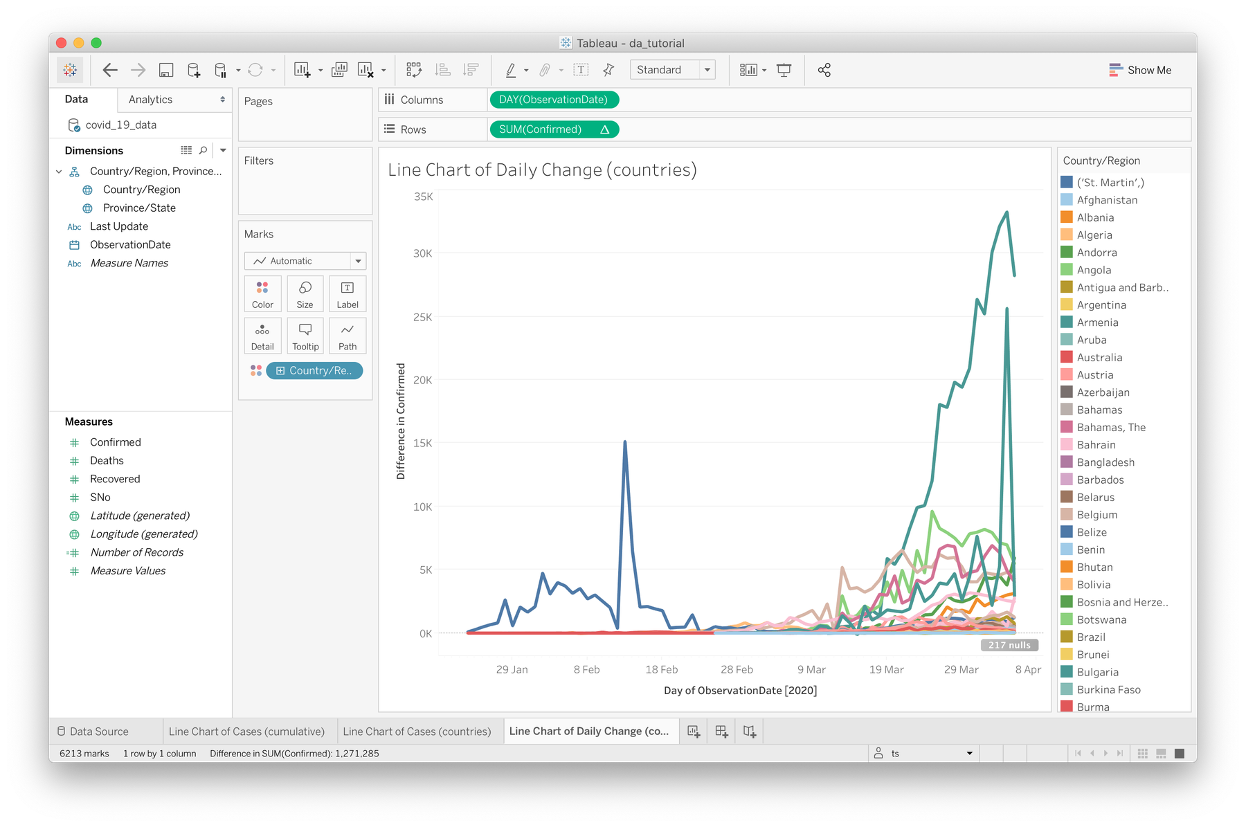

Visualising daily increases
- Duplicate your current sheet and call it something like "Line Chart of Daily Change (countries)"
- On the green "SUM(Confirmed)" pill in the rows drop-field above, right click and choose Quick Table Calculation → Difference. Quick table calculations allow you to apply common table based calculations to quickly visualise difference, percentages of totals etc.
- Under the same dropdown, make sure you're computing using "Table (across)"
Rollover these lines/marks to view the numbers behind the curves. At the time of writing, the US is currently growing at an average of 30,000 cases per day, while Mainland China's curve has flattened significantly. France also had a spike in cases (or at least a change in testing rates) on the 4th of April, which is far more visible here than the original running total graph.
Now is a good time to mention that I'm currently just experimenting with different ways of viewing this data, and without a specific investigation in mind there is no best way to visualise these cases. That said, let's dive into filters.