Filter your Data with a Bar Chart
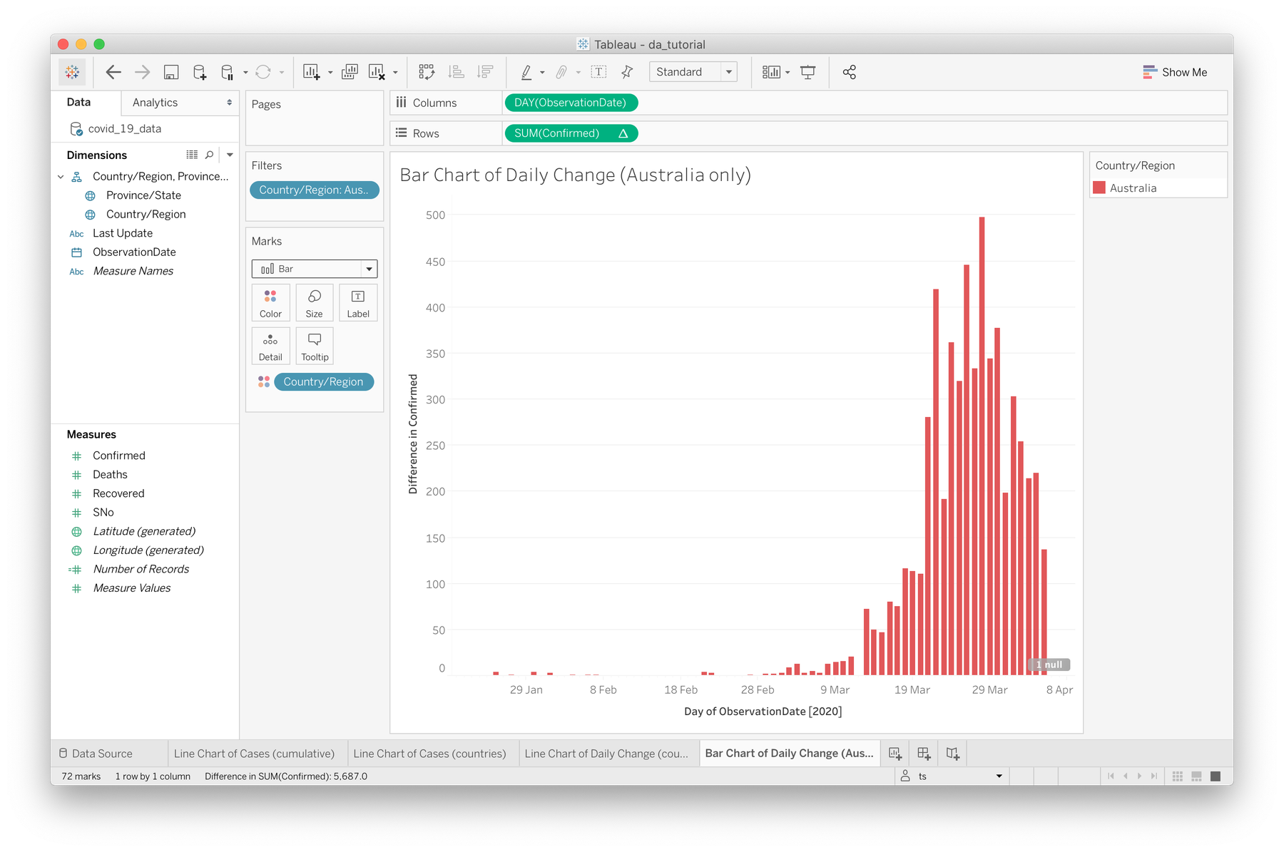
Filters in Tableau are a critical tool for focusing your attention on specific parts or areas of your dataset. In this case, let's just take a look at how Australia's confirmed cases are going. What we'll create here is a bar chart of Australia's curve of new daily cases.


Bar chart of Australia's daily cases curve
- Duplicate your current sheet (daily change of all countries) and call it something like "Bar Chart of Daily Change (Australia only)"
- Create a filter on the Country/Region field by dragging it onto the Filters shelf above Marks.
- In the filter prompt that appears we can now select which countires we'd like to look at. Select "None" first to deselect all, then select "Australia" and press OK.
- You should now see a single isolated line representing Australia.
- Change the mark type by selecting Bar from the dropdown of options in the Marks shelf.
- Finally, you might need to adjust the width of each bar by selecting Size in the Marks shelf.
Here's a video of this in action.
This gives us a great view of the progress that's being made by social distancing measures, however it's important to remember the greater context as these numbers are coming only from those who have been tested.
Stacked bar charts
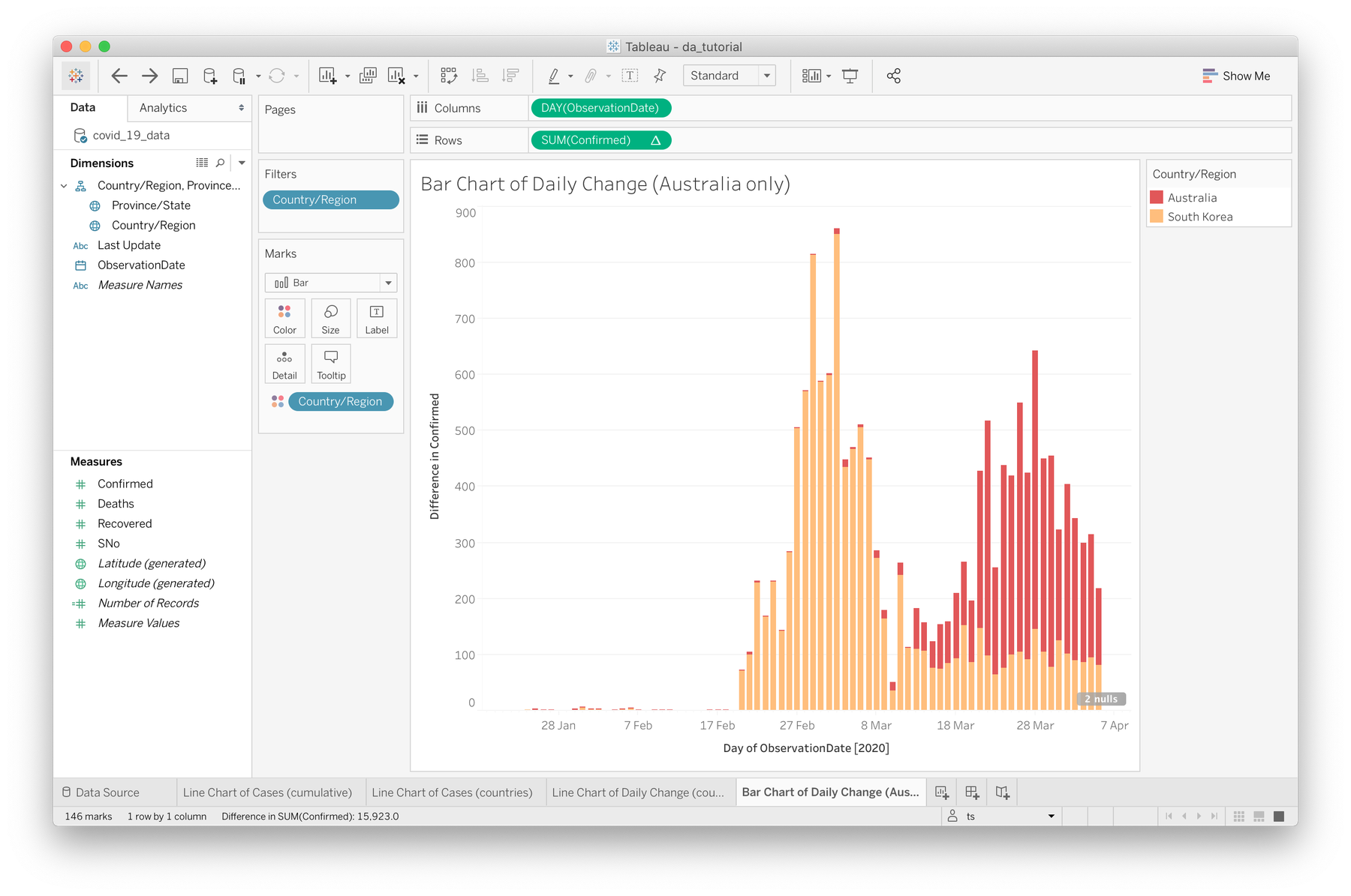
Now that we have a filter in place, we can easily modify it to create a stacked bar chart as a means of comparison between multiple countries. In this example let's compare Australia with South Korea, which had a significant outbreak in early March before their containment measures started taking effect.


- Right click on the Country/Region pill in the Filters shelf and choose Edit Filter...
- Check "South Korea" and click OK.
It's quite easy now that we have this filter infrastructure in place. Feel free to experiment here and compare as many countries as you'd like. Note that including countries with large daily increases such as Mainland China or the US may shift the scale of your graph significantly and reduce legibility for less affected countries such as Australia. This now becomes a representational question of what are you trying to show, or argue, or what insight would you like others to develop from looking at this?
Next we'll look at ways Tableau can help us visualise the ever-changing share of COVID19 cases between different countries.