Introduction
Welcome to our introductory tutorial of Tableau! Over the next few pages we'll dive into the popular data visualisation software and learn how to navigate the Tableau Desktop interface, add a data source and start visualising data. For this tutorial I'll be using the latest data available on the COVID19 outbreak, provided as a cleaned repository on Kaggle via John Hopkins University, which you can access here. Feel free to also download the workbook below with all of the graphs we'll be creating. If the data source goes down, you can extract it from here.


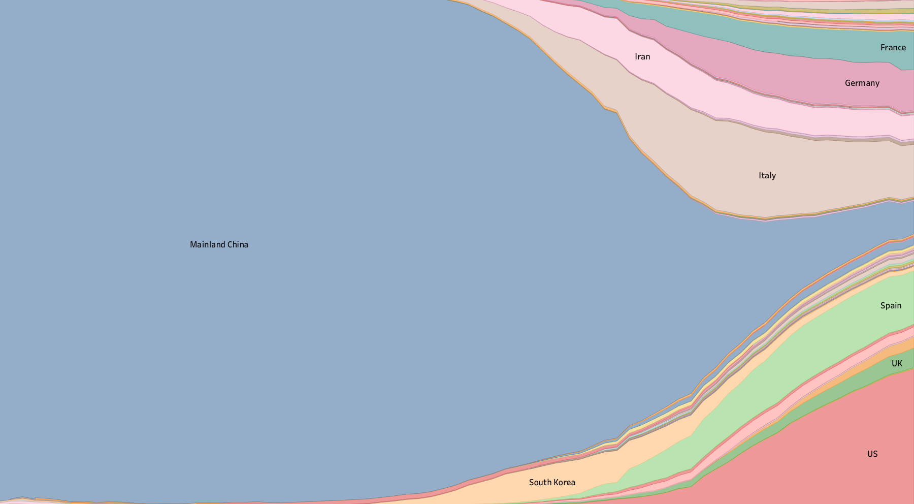
One of the many graphs we'll be creating
We'll learn how to add a data source, experiment with a number of built-in visualisation methods, and see how Tableau can help us make sense of our data. One thing to remember is that there is always more than one way to create something in Tableau, and I'm still learning myself. Feel free to divert along the way, try new things and let us know what works and what doesn't.
To follow along you'll need:
- A copy of Tableau Desktop (see this page to learn about access)
- The dataset mentioned above.
If you get stuck on any Tableau terminology, take a look at our glossary of terms here. Click "next" below or use the pages navigation to dive in!